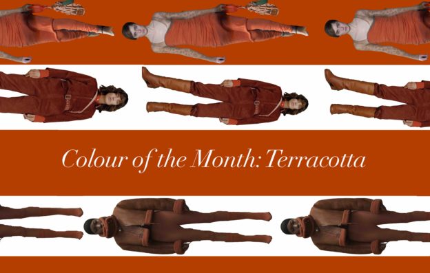
Scroll down to see my favourite ways to style this Pantone approved shade!
Welcome back to the colour of the month series. In an effort to make our way through what’s in for fall/winter 2016 and make sure you’re wardrobe reaches it’s season colour potential, I introduce you to the next must have shade in your fall palette. Enter Terracotta. Although it seems like a strange shade (I mean, is it orange? Is it brown? What is this colour.. is it kind of like tobacco?) It’s actually a great one to match with lots of colour combinations that are sure to get you noticed!
Images used in title graphic: A.P.C via Vogue.com, Yeezy via Vogue.com and Acne Studio via Vogue.com

Images used in graphic: A.L.C via Vogue.com, Tibi via Vogue.com, Pinterest, Pinterest, Pinterest, Pinterest
Burgundy + Terracotta
There is no denying this beautiful combination. If mother nature can work it (look at the autumn leaves, duh), so can you! It’s pretty much perfect for fall.
Purple + Terracotta
Anyone who knows me well knows that I am not a fan of purple, but even I cannot deny how well this combination goes… maybe it will convert me.

Images used in graphic: Pinterest, APC via Vogue.com, Pinterest, Pinterest, Pinterest

Images used in graphic: Pinterest, Dior via Vogue.com, APC via Vogue.com, Clover Canyon via Vogue.com, Pinterest, Pinterest, Pinterest
Blue + Terracotta
Is there anything that blue doesn’t go with? I love matching warm and cool tones together, the contrast is beautiful!
Special Mention: Terracotta + Pink
I think this is my all time favourite combination, or at least my current favourite combination… keep your eyes peeled because I’m going to be wearing this combo super soon!

Image used in graphic: Pinterest