Make sure to turn your Ad Blocker off so you can shop this page!
Photos by Joe Harper
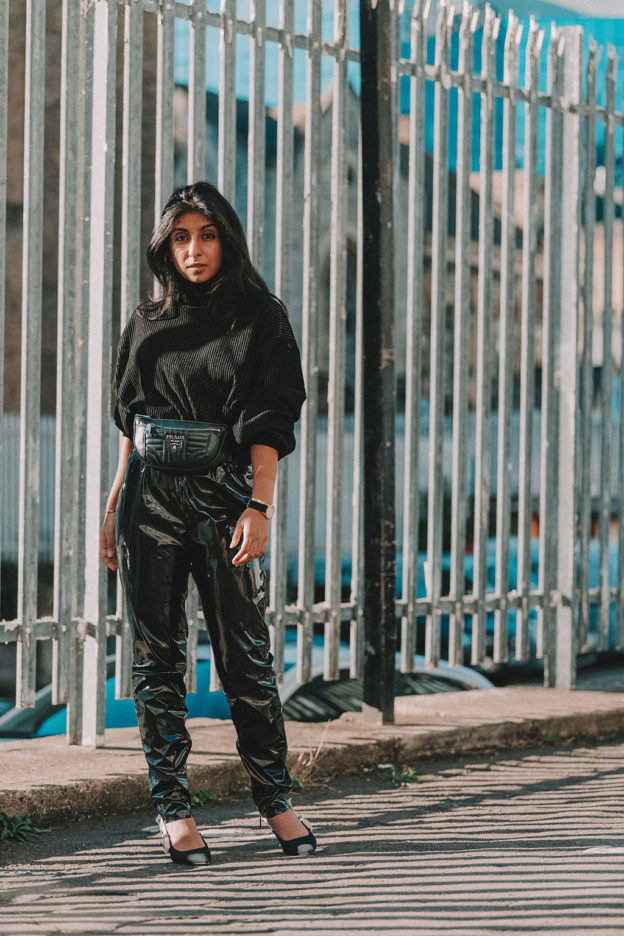
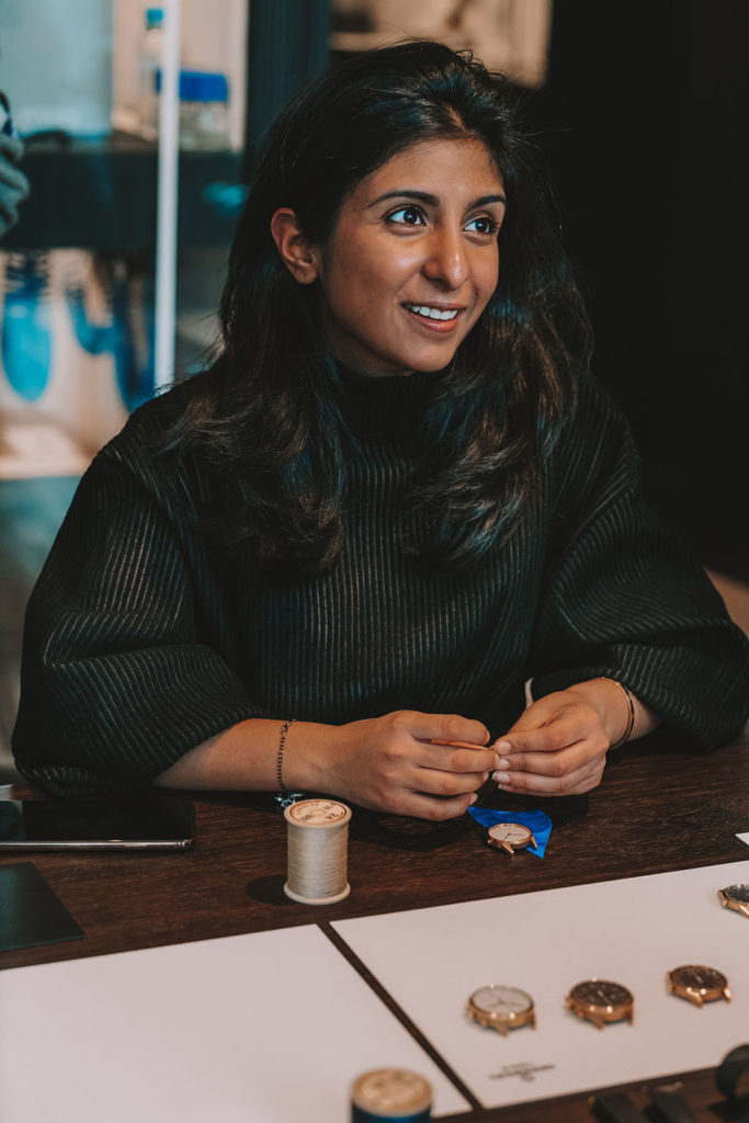
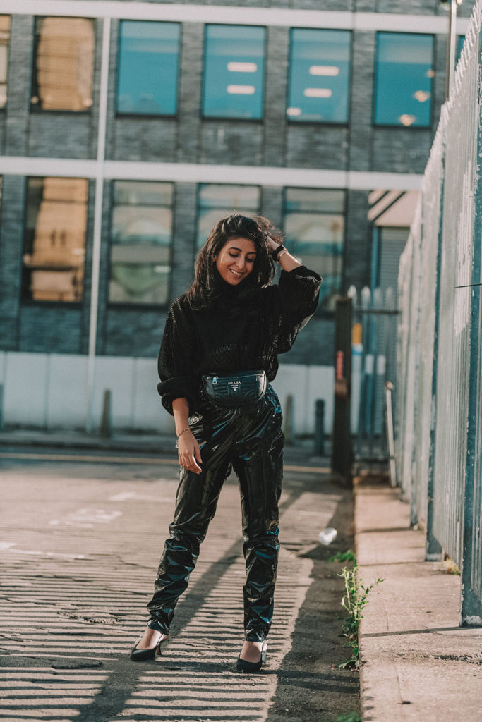
A little while ago I spent a day with fashion mega house Farfetch, learning all about their new watches and jewellery department and their collaboration with watchmakers Uniform Wares. Of course, for an occasion like this, I needed an outfit to match and I always say, when in doubt, go for an all black outfit. Some of you might think that an all black outfit is boring, or simply not inspiring enough but today I wanted to share with you the number one style trick on how to wear an all black outfit and still look incredible; mix textures.
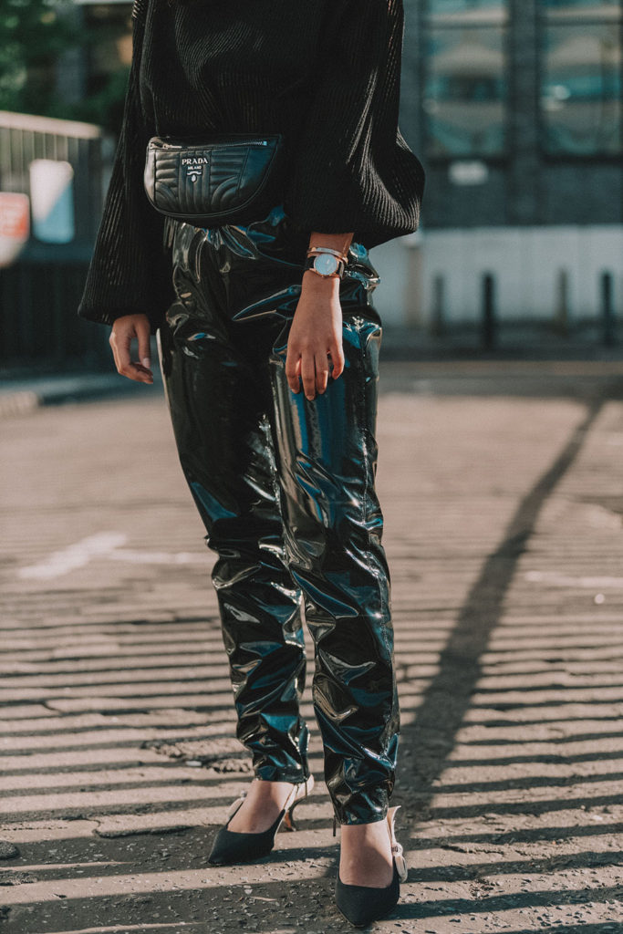
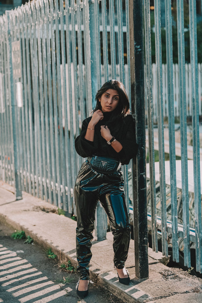
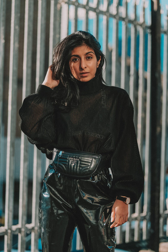
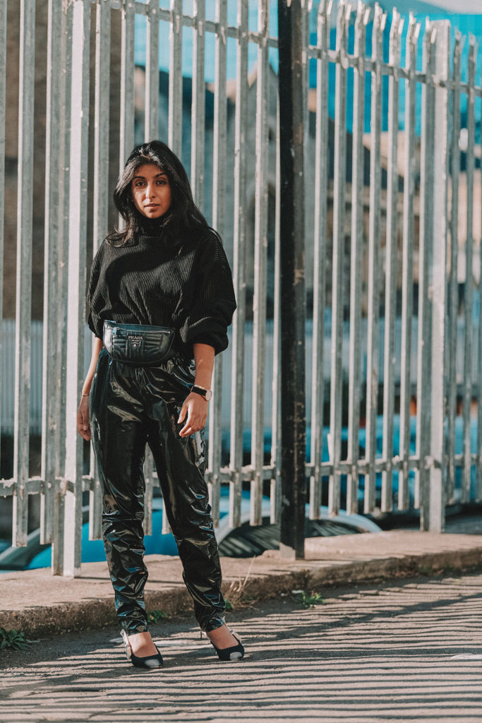
The key to making any outfit pop is to try and mix in textures and patterns to add different points of interests. In regards to how to style all black, the rules are the same. I opted for a whopping four different textures in one look through my various details. My top, which I actually bought on Farfetch a few months ago, is a mix of knit and sheer. It’s the perfect autumn blouse and also adds an element of pattern with its stripes. My high waisted leather pants were a gift from Farfetch for the event and I love the boldness the vinyl brings to the look. Pro tip: lotion your legs and your pants to stop them from squeaking!
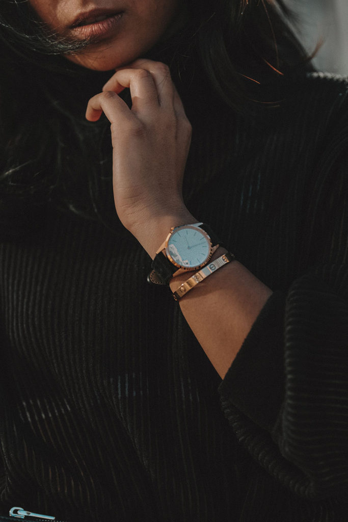
My accessories then complemented my look from my Prada belt bag in soft leather to my Uniform Wares watch with its beautiful suede strap. I actually got to customise my own strap which will be arriving in the next few weeks! All their materials are actually the same materials used by some of the biggest fashion houses in the world, but of course for much less! Now that’s luxury, isn’t it?
This post is not sponsored by Farfetch but thank you to Farfetch for gifting me these trousers.
Click for Links *Use Code x20oct for 20% off
(More affordable versions of my pieces linked in the widget above!)
Instagram; everyone’s favourite social media platform. As everyone from your mom to your friend’s cat makes their way onto Instagram and IGTV, standing out can seem harder than ever. If there’s anything I’ve learnt about the Instagram algorithm, it’s that it favours good content above all else. So, how do you take your Instagram level to the next level with better Instagram photos? Today I’m sharing three tips to think about every time you open your camera app to capture that perfect insta-worthy moment.
I would love to hear if you use any of these tips already and how they’ve helped you, or if you have any other questions about Instagram! Leave me a comment below!
When taking a photo in the camera app (or any camera app for that matter), the key to taking a good Instagram photo, and a good photo, in general, is to use the rule of thirds. To put it simply, the camera app will have a grid function which shows you a 3×3 grid on your screen. The key to a good photo is to have the point of interest be in any of the intersections in that grid. That is where your eye naturally draws to first.
I also like to sometimes put myself in the centre of the image, as long as my background allows for that. For example, in this photo here, I was standing on a corner. The pavement on either side was moving inwards to meet in the middle, so your eye is naturally drawn to this point.
Natural lighting is always best for taking better Instagram photos. It’s always more appealing to the eye and the balance in the photo will turn out better than you having to go through and fix it later. As you get better with natural light, you’ll notice that when there is too much light the photo can be too harsh, and if there is too little light, there isn’t enough depth. It’s about finding the source of light and trying to face it the best you can.
For example, in this image here, I found a window in a department store and I loved the way the light was coming in. By perching on the window and looking out, the natural light lit my face and created this image.
As you get more confident with lighting, you can also start to experiment with shadows and creating interesting imagery around that.
It’s always nice to have a pop of colour or a dominant colour in an image, no matter how monochrome heavy it may be. Having that pop of colour in your Instagram photo adds another layer of interest and depth and can also help you when you are thinking about how to put your Instagram feed together.
For example, in this image here, my colours are mainly black and white with gold but I added in that extra touch with the orange earrings and orange bracelet. That small change and detail really made the difference to this photo and gave it a new point of interest.
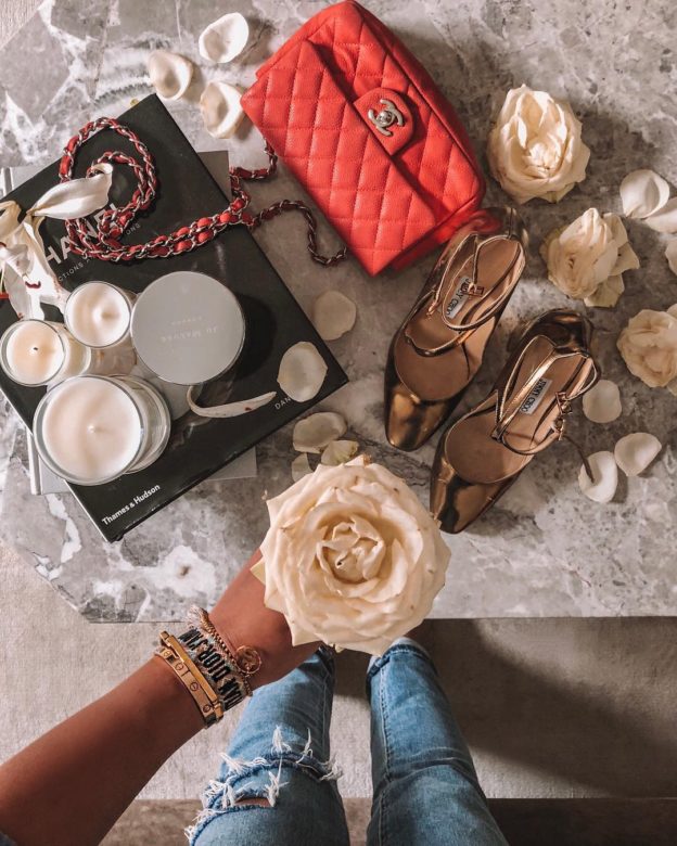
(Also note the use of symmetry in this photo, my grid was super helpful! But flat lays are a whole new story, would you want me to do a post about them?)
How do you get the perfect insta shot? Share with me in the comments below!